


*em space challenge
'Design a glyph that fits an em space both horizontally and vertically,' Niko Spelbrink.
This challenge was to be applied to a previous study, and would be intended as an extension of the typeface Avance (designed by Evert Bloemsma). The chosen concept was to design an alternative glyph that would work smartly amongst text, replacing all consecutive ‘e’, ‘t’ and ‘c’ letters as well as the following period. The design process is designed in publication form, a small portion of which is shown below.
This challenge was to be applied to a previous study, and would be intended as an extension of the typeface Avance (designed by Evert Bloemsma). The chosen concept was to design an alternative glyph that would work smartly amongst text, replacing all consecutive ‘e’, ‘t’ and ‘c’ letters as well as the following period. The design process is designed in publication form, a small portion of which is shown below.


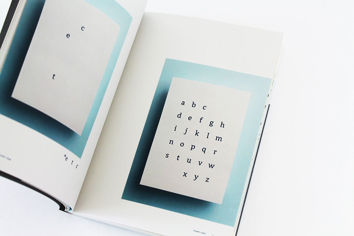

*initial conept


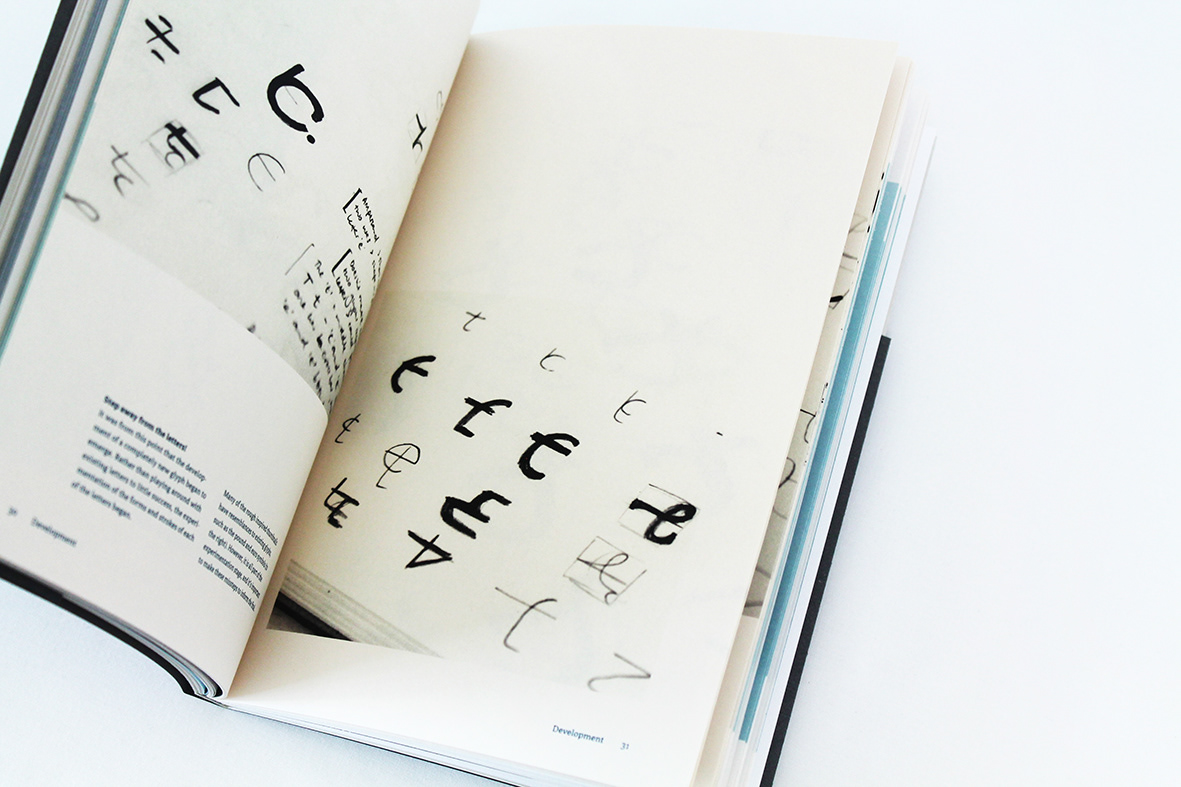
*concept development

*final project outcomes (to date)

*trial one: This result gives the sequential essence of each of the letters; ‘e’, ‘t’ and ‘c’. Because of this close relationship it would be ideal to develop this concept further to achieve a glyph with potential to be adopted into the English language — if not in long text, then possibly as a shorthand symbol (Twitter).


*trial two: Similar to trial one, the forms that indicate each letter can be identifi ed in this glyph in sequential order, but with an overall emphasis on the ‘t’ shape. Both the ‘e’ and the ‘c’ share the same stroke as they are almost identical in shape. The ‘t’ is indicated by the cross bar.
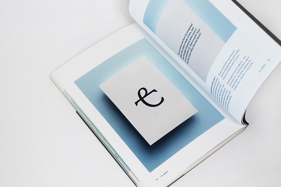


*trial three: The third trial holds a strong relationship with the second. They are so closely related that they could be seen as a version of each other. Through development, each contain almost identical representations of ‘etc’, however trial three is much more cursive in nature. In this way the second outcome is more suited to the modern half-serif face of Avance.


Thanks for viewing!


